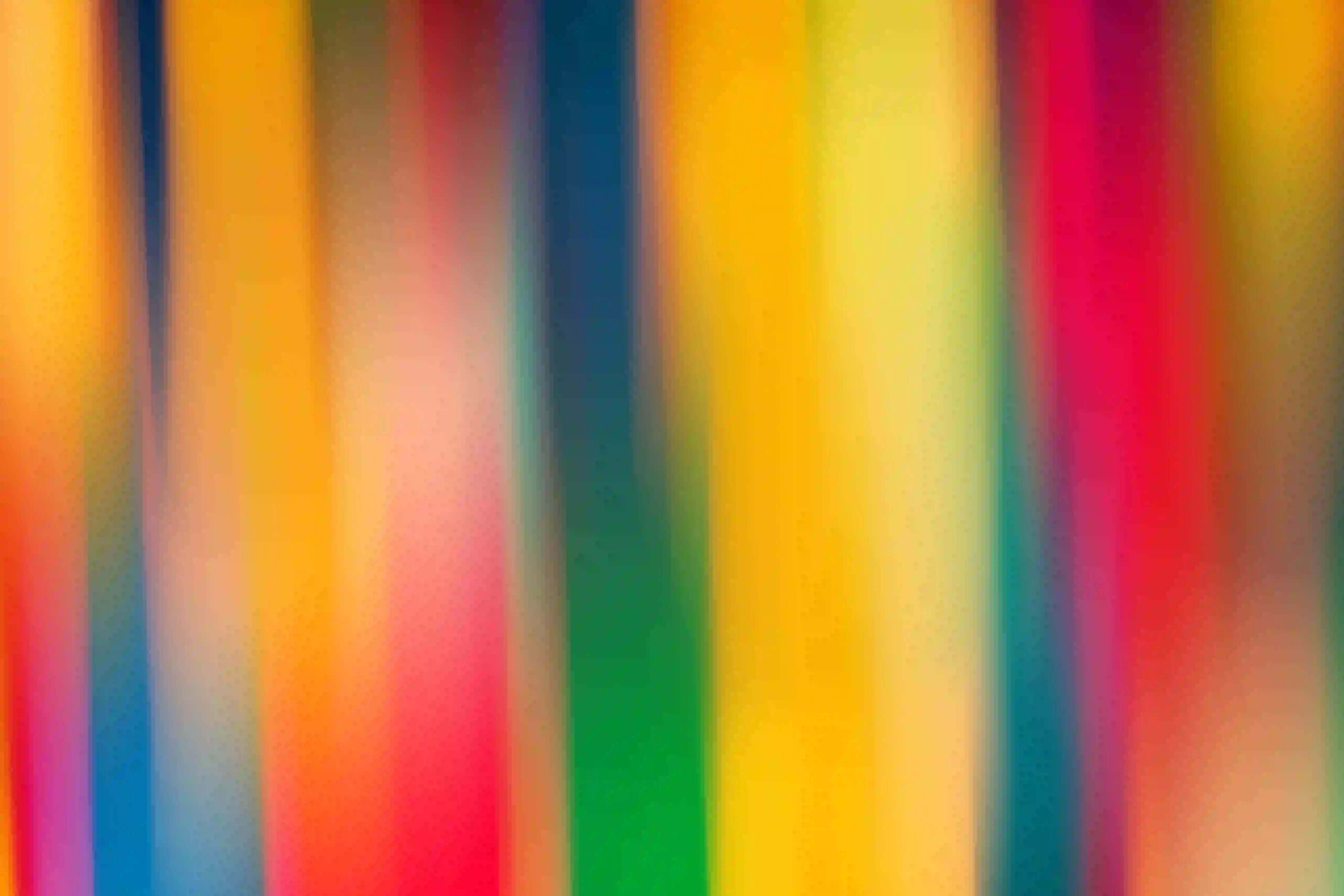
What are the top 3 popular colors? If you want the short answer, it's blue, green, and red.
That answer sounds simple, but the reason it keeps holding up is more interesting. Blue has the strongest support in public preference surveys. Green keeps gaining ground because it feels natural and fresh. Red never really leaves because it grabs attention fast and carries a lot of emotion.
If you follow the color walk trend, you'll notice something pretty quickly: the most popular colors are not just trend words. They're everywhere. In the sky, on street signs, in shop windows, on packaging, in clothes, and in the little visual details you usually miss.
The 3 Colors People Keep Coming Back To
If you're looking for one clean list, here it is: blue, green, and red.
Blue has the strongest evidence behind it as a favorite color. In YouGov's cross-country survey, blue came out on top across all 10 countries they studied. In YouGov's US results, blue also led by a wide margin, with red and green following behind.
That doesn't mean every person, brand, or trend report will rank colors the exact same way. They won't. Home design reports often push whites, beiges, or blue-greens. Fashion can swing brighter or moodier depending on the year. But if you zoom out and ask which colors keep showing up in preference, culture, and everyday visibility, blue, green, and red are the strongest three.
Blue: Calm, Trusted, Everywhere
Blue is the easiest one to defend as the most popular color.
Part of that comes from emotion. Blue often feels calm, open, and dependable. That's probably one reason it performs so well in public surveys. Another reason is simple exposure. You see blue in the sky, water, denim, sportswear, apps, road signs, and brand identities. It's familiar without feeling boring.
On a color walk, blue can be surprisingly varied. Some days it feels soft and distant, like a washed-out morning sky. Other times it feels sharp and urban, like painted doors, transit signs, or bright running shoes passing by.
That's what makes blue interesting. It's common, but it rarely looks exactly the same twice.
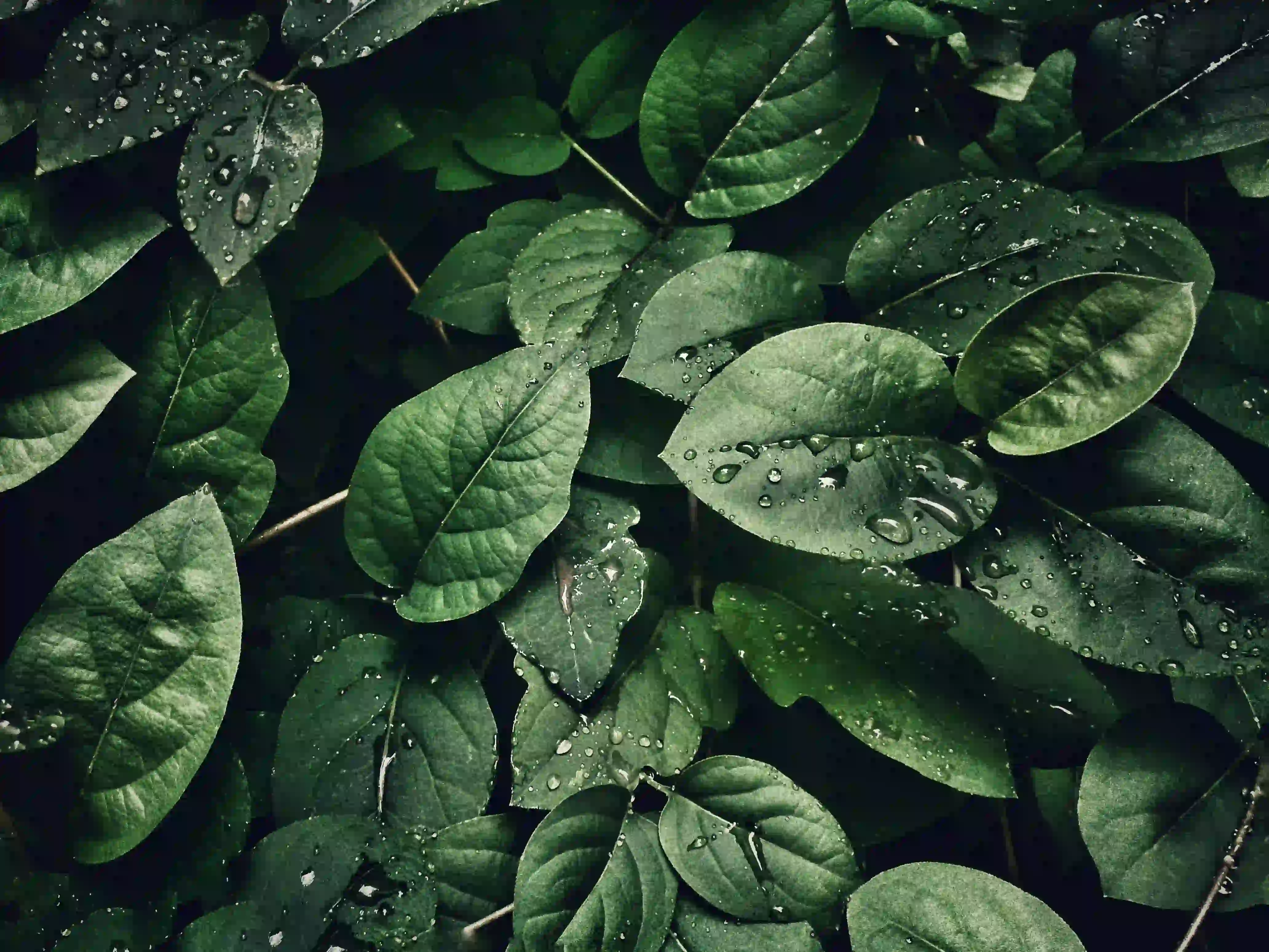
Green: Natural, Fresh, and Rising
Green is one of those colors that keeps getting stronger the more you pay attention.
In broad preference data, it often sits close behind blue. In design and home trend coverage, it has also become more prominent. Recent paint and interiors direction from brands like Valspar and Behr points toward greens and blue-greens as major current choices, which helps explain why green feels especially current right now.
Still, green is not only popular because it's trendy. It has a built-in advantage: it already exists all around you. Trees, grass, parks, produce aisles, reusable packaging, café plants, painted fences, and muted interior accents all push green into everyday view.
If you're going to start a color walk, green is probably the easiest first pick. You don't need to hunt for it. You just need to notice how many different versions of green your area already contains.
Red: Bold, Emotional, Impossible to Ignore
Red works differently from blue and green.
People do not always describe red as relaxing or easy to live with. But popular does not only mean calming. It also means memorable. And red is very, very memorable. It shows up in warning signs, sale stickers, lipstick, sports logos, food packaging, traffic lights, and tiny street details that pull your eye before you even realize it.
That's the power of red. It speeds up attention.
During a color walk, red often feels like punctuation. You may walk past twenty quiet surfaces before one red object cuts through the whole scene. A mailbox. A sneaker stripe. A takeout sign. A flower in a crack by the curb. Suddenly your pace changes, because your eyes have something to lock onto.
Why These Colors Stand Out on a Color Walk
Popular colors stay popular for more than one reason. People like them, yes. But they also repeat across the places where daily life happens.
Blue stretches across natural space and modern systems. Green connects to growth, calm, and the physical world. Red interrupts, signals, and energizes. That's a big part of why these three colors are so easy to notice once you start looking for them.
A color walk makes this much more real. Instead of reading that blue is popular, you see how often blue frames your day. Instead of hearing that green feels restorative, you notice where green softens a hard city block. Instead of being told red is attention-grabbing, you watch it pull your focus in real time.
That shift matters. You stop treating color as a design concept and start seeing it as part of your environment.
Try Your Own Color Walk With One Popular Color
Want to make this article useful right away? Pick one of the three colors before you head out.
Blue is great if you want a calm, spacious walk. Green works well if you want to feel grounded and connected to your surroundings. Red is the most playful option if you want contrast, surprise, and quick visual hits.
Then keep it simple. Walk for 10 to 30 minutes. Don't try to collect perfect photos or turn it into homework. Just notice where your color appears, what materials it shows up on, and how it changes from one setting to another.
If you want to keep going, you can explore the benefits of a color walk or browse more color walk ideas. The point is not to prove a theory. It's to train your eye and enjoy the way color keeps showing up in ordinary life.
The Bottom Line
So there you have it: the top 3 popular colors are blue, green, and red.
Blue leads because people trust it and see it everywhere. Green feels alive, restorative, and increasingly current. Red stays in the picture because it creates impact fast.
And if you want the answer to feel less abstract, take it outside. Open Color Walk, choose one color, and see how often the world brings it back to you.
FAQ
Why is green becoming more popular?
Green feels current for two reasons. First, many people already associate it with nature, calm, and freshness. Second, recent home and paint trend reports from brands like Valspar and Behr have pushed greens and blue-greens more strongly, which keeps the color visible in everyday design culture. Green also benefits from being easy to find in real life, so it feels familiar rather than forced.
Are popular colors the same as trending colors?
Not always. Popular colors are the ones that stay widely liked or widely seen over time. Trending colors are often tied to a season, brand forecast, or short-term cultural moment. That's why a yearly trend report may highlight a beige, plum, or blue-green, while broader preference surveys still keep blue near the top. One describes the moment. The other describes the pattern.